Power E*TRADE tools: Snapshot Analysis & TradeLab
E*TRADE from Morgan Stanley
When trading options, understanding how a position might behave across different market scenarios is just as important as choosing the strategy itself. On Power E*TRADE and Power E*TRADE Pro platforms, tools like Snapshot Analysis and TradeLab are designed to help traders visualize potential risk and reward before placing a trade. Snapshot Analysis provides a quick, intuitive view of a single trade’s payoff profile, while TradeLab allows for deeper strategy modeling and “what-if” analysis across price, time, and volatility. Together, these tools can help traders move beyond guesswork by turning options mechanics into clear, actionable insights.
Snapshot Analysis
To analyze a potential options strategy, click the Snapshot Analysis tab within the Order Ticket. Broken into both quantitative and visual metrics, you will find the max profit/loss and risk/reward probabilities numerical values associated with your selected strategy.
The specific example trade illustrated below is a short put vertical spread, where you are selling a put and buying a lower strike put, collecting a net credit up front as a result of the higher strike sale. You would want the underlying price to stay above the short put strike price through expiration. Breaking down the information provided in the Snapshot Analysis tool, Risk/Reward at Expiration section:
- The maximum credit you could collect from the sale is $170, which would occur if the underlying stays above the short strike at expiration. There is about a 62% chance this will occur
- If the underlying falls below the price of the long put, you would be hit with the max loss of $330. This amount is capped because you own the lower strike put, and the probability for maximum loss is about 36%
- Your breakeven price is $6288.30 -- if the underlying finishes above this price at expiration, the trade makes money; below this price and you lose money. There is about a 62% probability for any profit
- You are risking $1 to make $0.52
The risk profile graph displayed on the right side of the tool, sometimes referred to as a "risk curve," is an interactive display of the range of profit or loss possibilities for a trade. This graph provides an easy way to understand and visualize the effects of what may happen to a position based on the underlying price.
Notice you can slide over the risk profile graph to adjust for potential stock price changes to see how that could impact the theoretical profits or losses to the strategy. Please note that probabilities are subject to change based on factors such as market conditions and changes in volatility. Breaking down the information and values displayed:
- X-axis: underlying price of the security
- Y-axis: potential profit and loss values in dollars
- Green lines: the profit zone, which you see level off at the listed Max Profit value of $170
- Red lines: the loss zone, leveling at the Max Loss value of $330
- Current line: profit/loss today
- Expiry line: profit/loss on the trade's expiration
- Theo. P/L at Expiry: worst case scenario, a theoretical maximum loss value of $330
- Current Theo. Price: mark-to-market value before expiration, theoretically a loss of $136.61
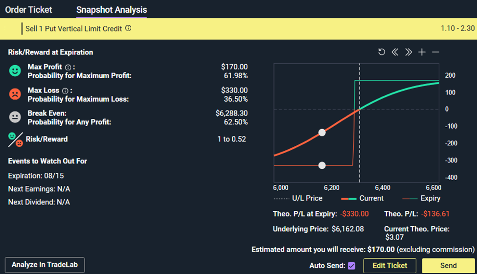
Fig 1. Snapshot Analysis reflecting the max profit, max loss, break even, and risk reward ratio values along with a risk profile visualization on a bull put spread
TradeLab
To further analyze the strategy, select Analyze in TradeLab at the lower left of the Snapshot Analysis tool. While the Snapshot Analysis tool is showing static max profit/loss values at expiration, the Spectral Map is an analysis and visual display of percent market gain, delta, gamma, or theta, along with how they are expected to evolve over time in price between now and expiration.
Refer to the dropdown menus on the upper left corner of the map to select which type of analysis should be performed, as well as IV forecast logic. The future side of the map allows you to horizontally scroll through a timeline to explore "what-if" scenarios, while you can vertically scroll through prices of the underlying security. While scrolling, displayed market gain dollar value and percents adjust accordingly.
- X-axis: time (historical on the left; future on the right)
- Y-axis: underlying price
- Green shading: favorable outcome (profit)
- Red shading: unfavorable outcome (loss)
- If the underlying is around $47.74 on 1/14, it is projected to fall within profitable territory
- Roughly 74% of the maximum potential market gain realized without needing to wait until expiration
- There is about an 87% chance that the underlying security will close within a price range of 39.58 - 48.23
- If the stock goes up $1, the trade gains about $96 (delta)
- With each day that passes, about $2.78 is added to the P/L (theta)
While you move through various price and time scenarios, you'll notice the projected, theoretical market gains update, as will the Spectral Slice. In the Greek Risk Metrics section, you can select to view the what-if metrics as their Greek values (Delta, Gamma, Theta, Vega, Rho). Selecting English will break down the meanings behind each specific Greek value. For example, as opposed to labeling a value as simply "delta," selecting the display as English will instead articulate the value through price sensitivity.
If the trade fits your risk profile and you’d like to enter an order, click “Trade” from TradeLab.
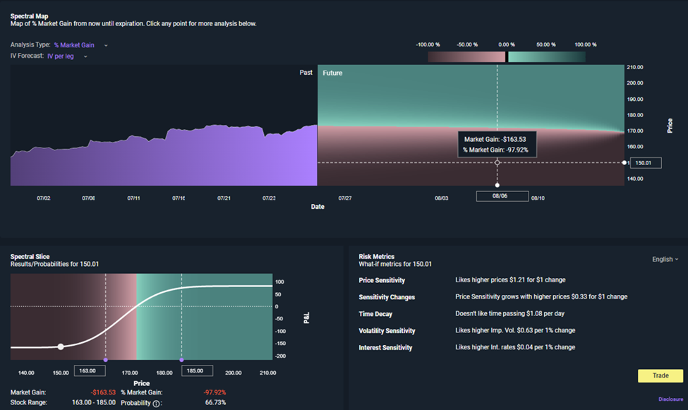
Fig 2. The TradeLab tool custom option strategy analysis of market gain and what-if metrics
By incorporating Snapshot Analysis and TradeLab into your trading process, you may gain more than charts and numbers. These tools are designed to give perspective; to help traders visualize potential outcomes, understand trade-offs, and approach option strategies with greater clarity and confidence before entering a position.
Note: Maximum profit/loss displays do not include dividends, assume no early exercise, and depict strategy risk only up until the nearest option expiration date in the strategy. Risk profiles can change dramatically as a result of option exercise and assignment, particularly when the quantity exercised or assigned differs across strategy legs and/or results in an unanticipated position in the underlying security. Please note that assignment of in-the-money short legs and non-assignment of out-of-the-money short legs of complex options strategies are not guaranteed and that early or partial exercises and assignments of complex options positions, including the potential assignment of out of the money legs of complex options strategies may expose you to market and carry risk greater than the displayed maximum loss estimate, including losses in excess of your original investment.
The probability projections and other information generated by Spectral Analysis regarding the likelihood of various investment outcomes are hypothetical in nature, do not reflect actual performance, and do not guarantee future results. The volatility used to calculate probabilities is the average at-the-money (ATM) volatility of each leg in the trade.