Understanding technical analysis charts and chart types
E*TRADE from Morgan Stanley
Most technical analysis is performed by observing and interpreting charts. A chart is a historical record of stock price movements plotted over a time period, like one day, one year, one decade, or even longer.
The vertical scale, or Y-axis, of a chart represents the price of a stock. The horizontal scale, or X-axis, represents time. In this article, we will review three types of charts—line charts, bar charts, and candlestick charts.
Line charts
The simplest chart is a line chart. This chart is typically constructed using the closing price of a stock. For example, the line chart in Figure 1 is a daily chart of the S&P 500®. This chart records the closing price of the S&P 500.
S&P 500 daily line chart
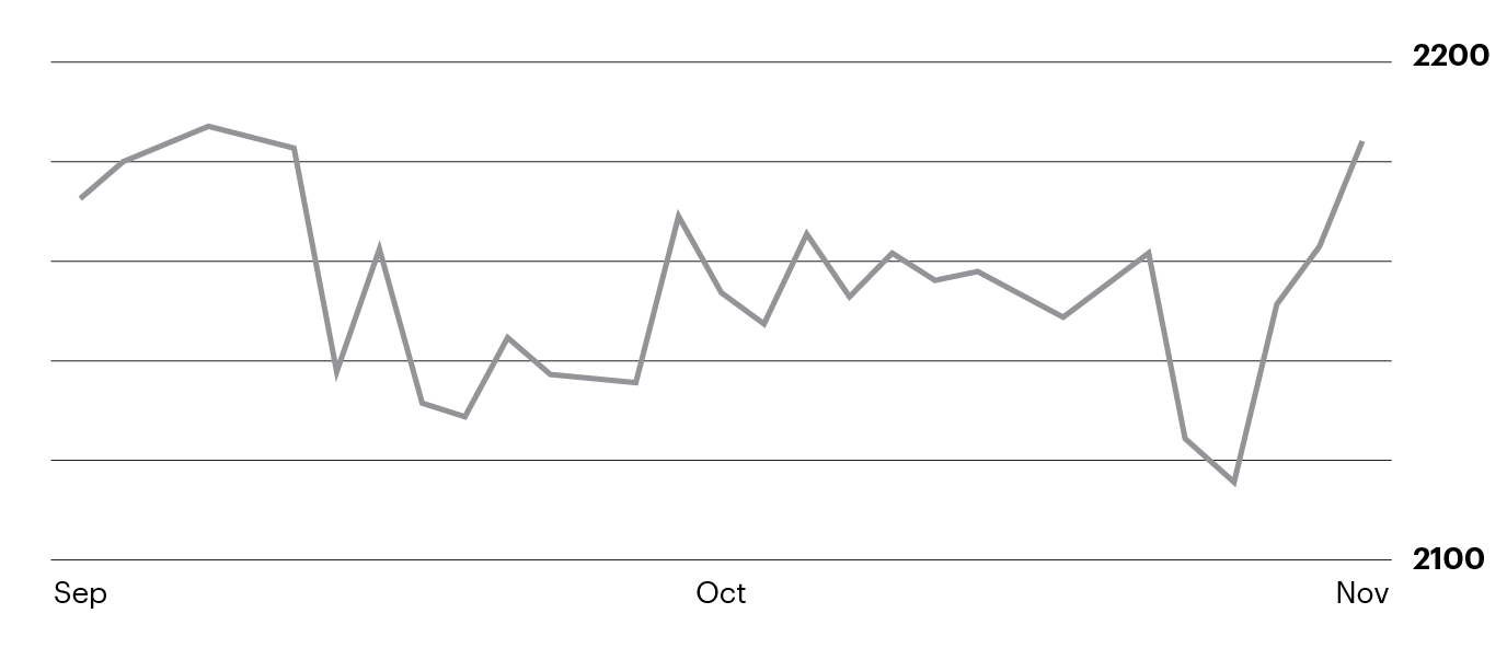
Figure 1. For illustration only not a recommendation
Some traders prefer using line charts because these charts are simple and easy to interpret. Line charts can be a good type of chart to begin understanding technical analysis.
Bar charts
Compared to a line chart, a bar chart is slightly more complex in that it contains more data and historical prices. A bar chart is constructed using a vertical line for each period. The vertical line represents the low and high prices during a specific period like daily or weekly. Horizontal lines denote the open and close prices during this period.
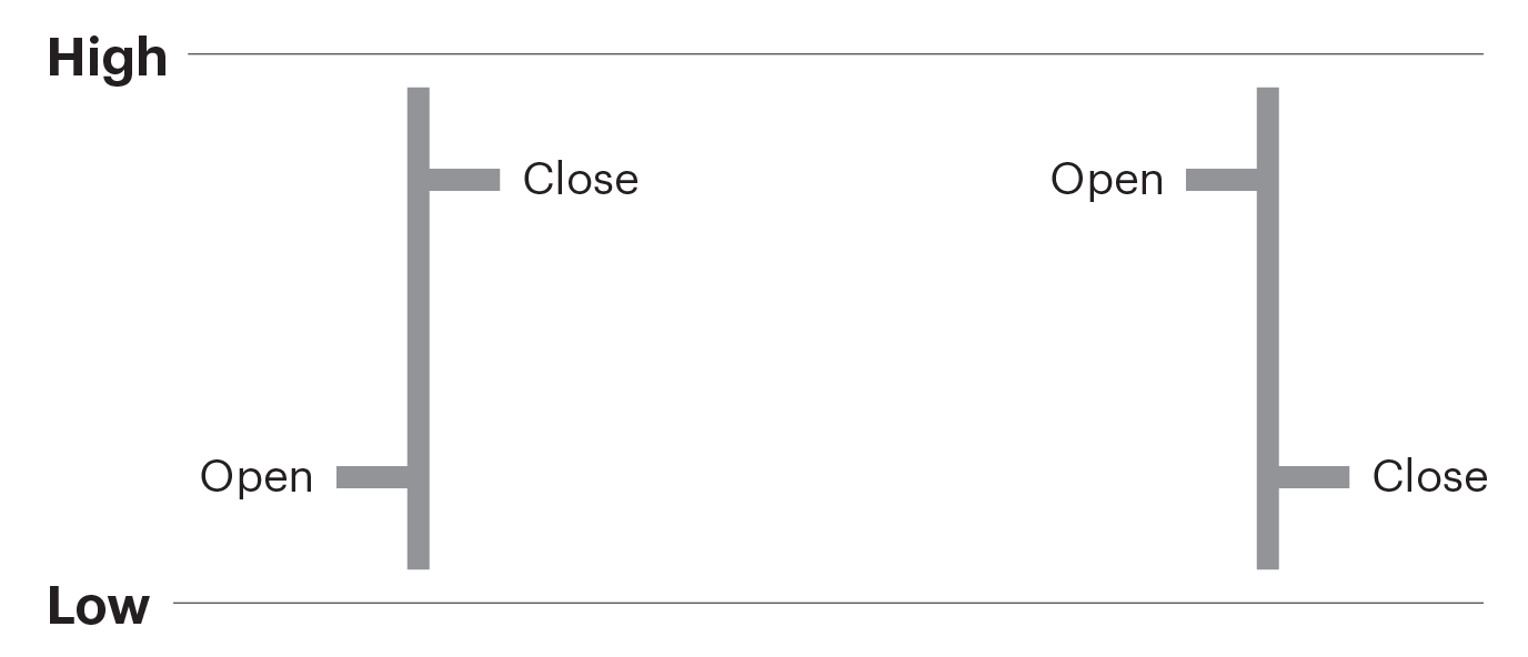
For example, the chart in Figure 2 is a daily chart of the S&P 500 that goes back 30 days. The vertical lines of the bars represent the low and high prices at which the S&P 500 traded each day. The small horizontal line on the left side of the vertical bar denotes the price at which the S&P 500 opened each day. The small horizontal line on the right of the vertical bar denotes the price at which the S&P 500 closed for the day.
S&P 500 daily bar chart
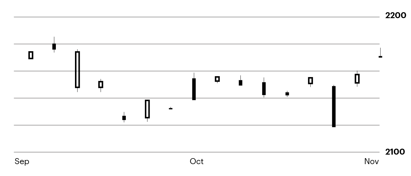
Figure 2. For illustration only not a recommendation.
Since a bar chart includes four prices (open, low, high, and close), some traders prefer using this type of chart when more detail is desired.
Candlestick charts
A third type of chart that’s popular among traders is a candlestick chart. Like the bar chart, a candlestick chart incorporates four historical prices (open, low, high, and close).
The vertical line of a candlestick denotes the high and low for the day, similar to the bar chart. The difference between bar and candlestick charts is how candlestick charts display the day’s open and close prices. The body of the candlestick represents a stock’s opening and closing price. Importantly, the color of the candlestick denotes a higher close in green, or lower close in red, for the day.
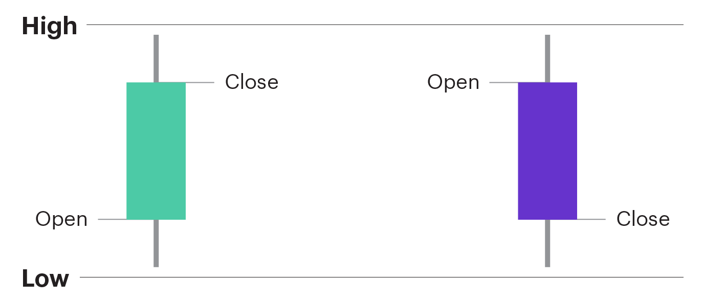
For example, the red candles in the chart in Figure 3 denote days when the S&P 500 closed lower than the previous day. In contrast, green candles denote days when the S&P 500 closed higher.
S&P 500 daily candlestick chart
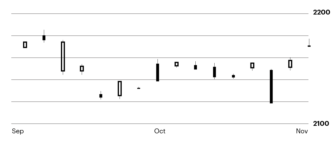
Figure 3. For illustration only not a recommendation
Some traders prefer using candlestick charts because there are specific patterns in the candlesticks that can be actionable. But, it takes some time and experience to learn how to identify candlestick patterns.
There’s no right or wrong answer when it comes to which chart type to use when trading. When choosing a chart type to work with, you could practice looking at the same stock across different chart types. You may find one type of chart that works for you. Once you decide on a chart type, start looking for historical patterns like trends, support and resistance, and other actionable patterns.