Understanding technical analysis price patterns
E*TRADE from Morgan Stanley
One of the assumptions of technical analysis is that history repeats in the stock market. One example of this is recurring patterns in historical stock prices. These price patterns are essentially shapes that sometimes appear on stock charts. The patterns are typically constructed by combining support and resistance levels. This means that the price of a security typically only moves up to a certain price, or resistance level, and will decline to a certain price, or support level, based on a trader’s willingness to buy or sell the stock at a certain price.
Price patterns generally fall into two categories: continuation and reversal. Additionally, there are bullish and bearish versions of continuation and reversal patterns.
Continuation price patterns point to a continuation of the prevailing trend in a stock price. For instance, a bullish continuation pattern might point to an uptrend continuing higher. Conversely, a bearish continuation price pattern might point to a downtrend continuing lower.
In contrast, reversal price patterns generally signal an end to a prevailing trend in a stock price. For example, a bullish reversal might point to an end of a downtrend and the beginning of a new uptrend. Conversely, a bearish reversal price pattern might point to an end of an uptrend and beginning of a new downtrend. In this article we will show six types of continuation and reversal patterns.
Bullish continuation
A cup-and-handle is a bullish continuation price pattern that forms in the context of an existing uptrend. The pattern looks like a tea cup and is complete when a stock breaks out above horizontal resistance. Some traders may use this breakout as a signal to buy a stock. You can see an example of a cup-and-handle in Figure 1, which completed when the stock experienced a breakout above $12.
Cup-and-Handle price pattern example
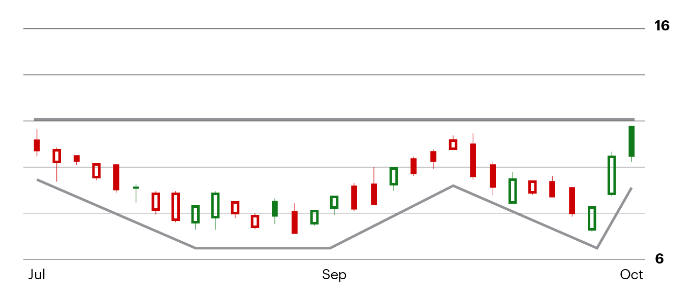
Figure 1. For illustration only not a recommendation
A bull flag is another bullish continuation pattern that forms in the context of an existing uptrend. The pattern is called a bull flag because it looks like a flag at the top of a flagpole, where the existing uptrend defines the flagpole. You can see an example of a bull flag in Figure 2. Some traders may buy a stock when it breaks out above resistance at the upper end of the flag, which in this example occurred at about $10.
Bull flag price pattern example
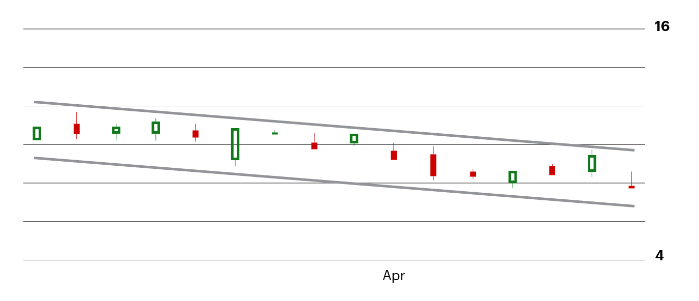
Figure 2. For illustration only not a recommendation.
Bearish continuation
A bear flag is an upside down version of a bull flag. A bear flag forms in the context of a downtrend and points to a continuation of the downtrend if the pattern completes. You can see an example of a complete bear flag in Figure 3, where the breakdown below support at $100 caused the downtrend to resume. Some traders may sell a stock if it breaks down from a bear flag in anticipation of further downside and in an attempt to limit losses.
Bear flag price pattern example
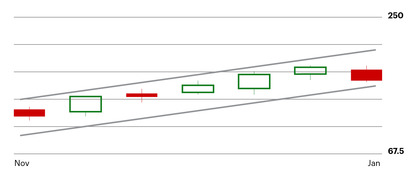
Figure 3. For illustration only not a recommendation
Bullish reversal
One of the most common bullish reversal price patterns is a double bottom. This pattern forms in the context of a downtrend and is complete when a stock trends down to horizontal support, stops trending down, and subsequently reverses higher. You can see an example of a double bottom in Figure 4. Upon observing a double bottom, some traders may buy a stock or if it’s already owned, set a stop loss order below support to manage risk.
Double bottom price pattern example
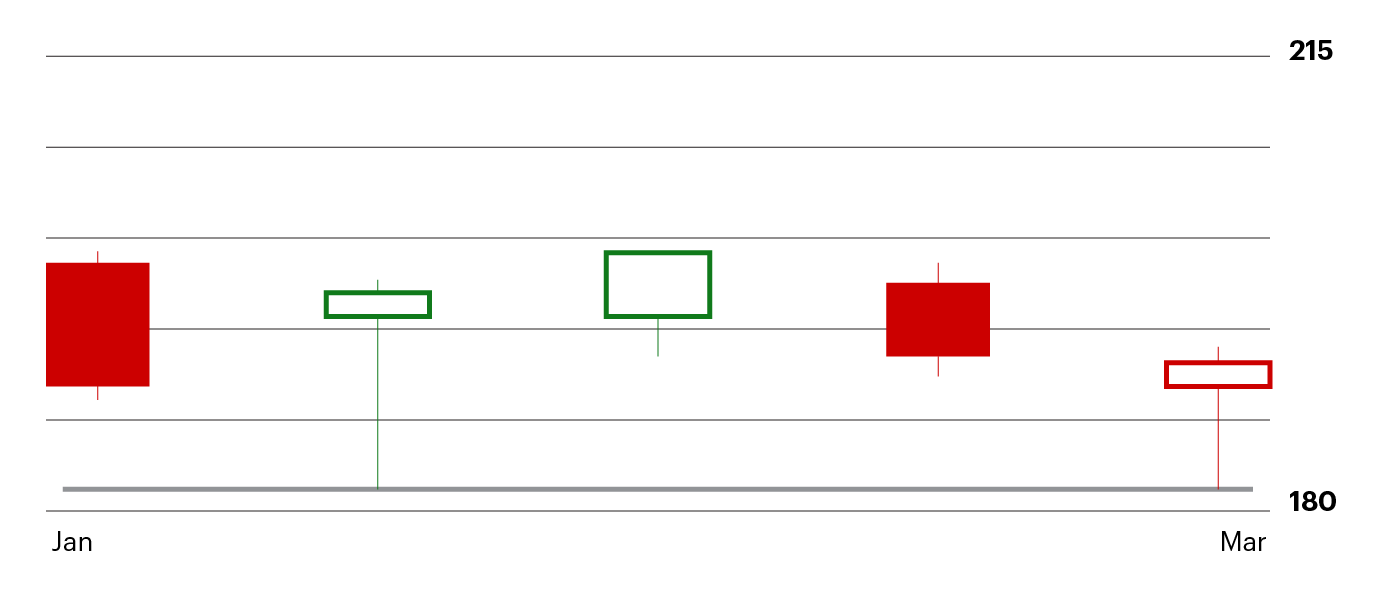
Figure 4. For illustration only not a recommendation
One of the more popular bullish reversal patterns is an inverse head-and-shoulders. The pattern looks like a head and pair of shoulders flipped upside down. An inverse head-and-shoulders confirms when a stock breaks out above horizontal resistance, which is also known as the neckline. The breakout in this example was at $30. Some traders may buy a stock after it forms an inverse head-and-shoulders and moves above the neckline. You can see an example of an inverse head-and-shoulders in Figure 5. Notice how this pattern formed at the end of a long-lasting downtrend.
Inverse head-and-shoulders price pattern example
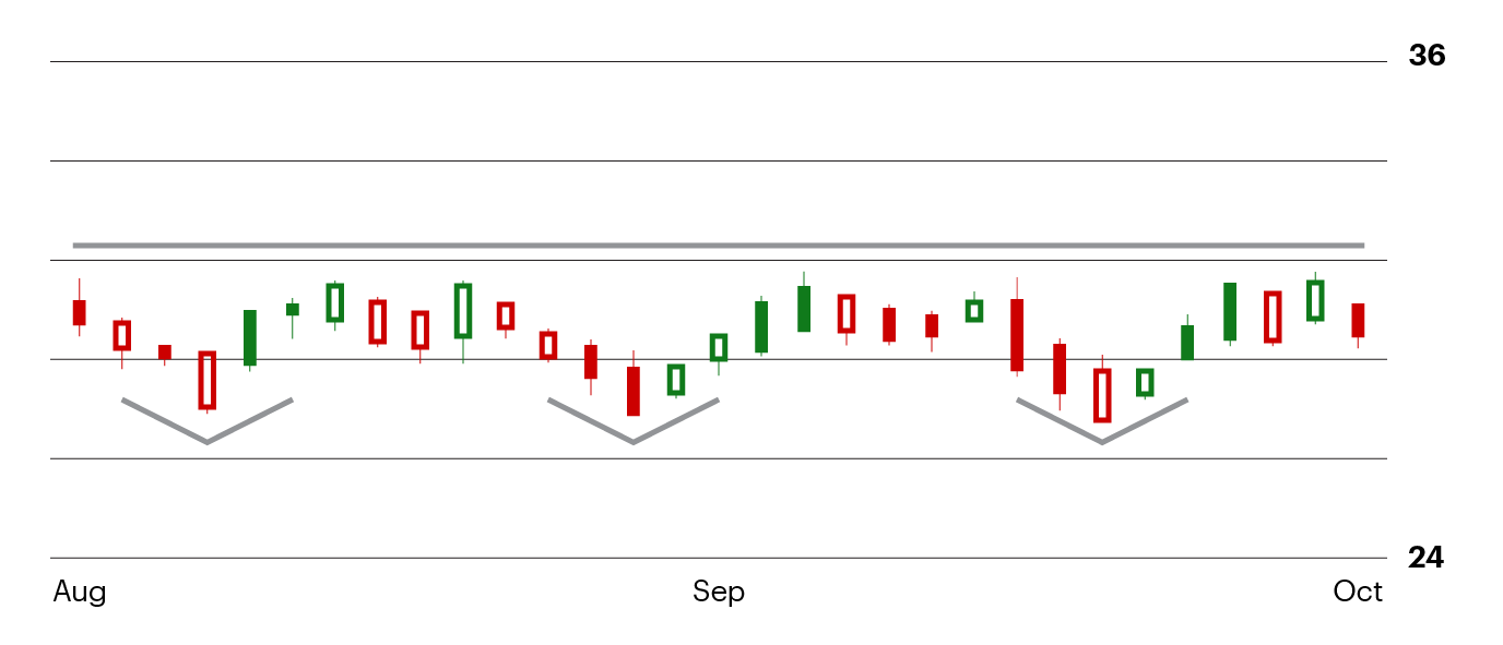
Figure 5. For illustration only not a recommendation
Bearish reversal
A head-and-shoulders is a bearish reversal price pattern that forms at the end of an uptrend. Like its bullish counterpart, a bearish head-and-shoulders looks like a head with two shoulders. The horizontal support of the pattern is known as the neckline which, in this example, was at $60. Some traders may sell a stock after it breaks below the neckline of a head-and-shoulders. You can see an example of a head-and-shoulders in Figure 6. Some traders may sell a stock if it breaks down below the neckline of the pattern in an attempt to limit losses.
Head-and-shoulders price pattern example
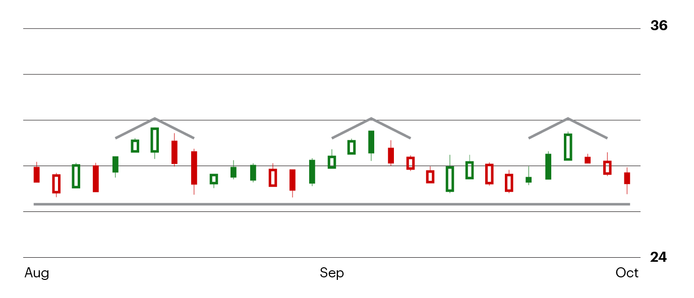
Figure 6. For illustration only not a recommendation
In this article, we discussed six of the most common price patterns. There are many more that traders may apply, but the key point to understand is that all price patterns incorporate support and resistance. You might practice identifying these patterns by looking at the charts of stocks you own. Importantly, you can find these patterns across all timeframes, from intraday 1-minute charts, all the way out to multi-year monthly charts.
As you’ve learned in this article, some traders use price patterns to determine when to buy or when to sell a stock. As you look for price patterns in stocks you own, pay attention to how these patterns play out over time. You may start to observe recurring patterns that could be actionable.